How do Boston Bruins’ Stanley Cup rings compare to other champs?
Remember the finale from "Indiana Jones and the Last Crusade" when (spoiler) Indy avoids turning into a disintegrating skeleton because he knows the Holy Grail should look like "the cup of the carpenter"? Which Jesus (spoiler) was?
Well, 14 kt. white gold rings with over 300 diamonds aren't exactly the stuff of a blue-collar, dirt under the nails, punch-a-Sedin-in-the-face team. But when you've captured hockey's holy grail, you've earned the right to flaunt it.
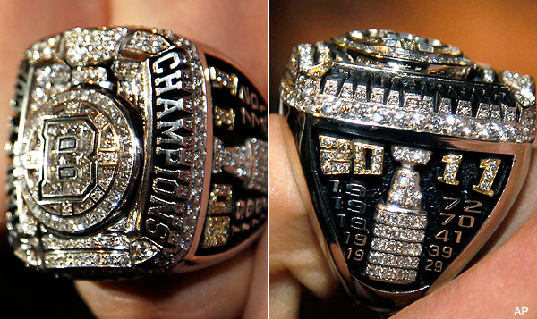
Here's the skinny on the 505 Boston Bruins 2011 Stanley Cup champions rings that were given to the players and team personnel on Tuesday:
The crest of the Boston Bruins 2011 Stanley Cup ring features diamond set images of the iconic Boston Bruins "B" logo and the Stanley Cup, fashioned in brilliant cut custom princess, princess and round diamonds set against a background of 14 kt. white gold. There are six larger round diamonds on the crest of the ring that represent the six Stanley Cups that the Bruins have won. The diamond-covered top of the ring is framed on the left side by "STANLEY CUP" and on the right side by "CHAMPIONS" to record the Bruins' 2011 achievement.
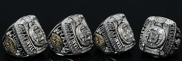
One shoulder is personalized with a player's last name and sweater number against an antique black background. The side includes an image the Bruins secondary "Bruins Bear" logo which is surrounded by six stones honoring the Bruins as being one of the "Original Six" professional hockey franchises.
The opposite shoulder of each ring features a diamond-studded Stanley Cup framed on top by "2011" in gold and diamonds which represents this year's team and the first Stanley Cup that the Bruins have won under the leadership of the Jacobs family. The years '72, '70, '41, '39 and '29 also frame the cup and connect this year's team to the earlier championship teams that helped build the Bruins into one of the most storied franchises.
Intricate and custom engraving on the inside of each ring enhances the distinct and one-of-a-kind design. The playoff slogan that decorated the locker room during the championship run, "FULL 60+ TO HISTORY", is on one side while the other shows the National Hockey League shield and the four playoff opponent's logos and series scores the Bruins won en route to the Stanley Cup.
Also, in honor of the aftermath of Game 7 in Vancouver, it doubles as a lighter …
Very impressive championship bling for the B's. But how does it stack up with other recent Stanley Cup rings? Glad you asked.
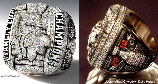
Here are the Chicago Blackhawks rings from 2010. Yes, there's from the same designer as the Bruins rings. Yes, we assume it's some kind of Original Six template:
From the Chicago Tribune, some details on the rings:
The individual rings, valued at about $30,000, are 14-carat white gold weighing 91.0 grams, with 404 diamonds and gemstones totaling approximately 8 carats. [...]
The ring features the iconic Indian head logo and the Stanley Cup displayed in marquee cut diamonds surrounded by the words "Stanley Cup Champions" on the face. They are personalized with a team member's name and number. One side features baguette-cut rubies and pear-shaped emeralds set in the shape of the Hawks' crossed tomahawks and the other is a diamond-studded Stanley Cup and the 2010 season's motto: One Goal. The years 2010, 1961, 1938 and 1934 also are included to commemorate the team's title history. [...]
The committee viewed examples of past championship rings but was determined to make the Hawks version unique. It incorporated ideas Jostens had not done before, including engraving the inside of each player's ring with the NHL logo and those of the four teams the Hawks dispatched in the playoffs and the series scores.
Here's what the Pittsburgh Penguins wore after their Cup win in 2009:
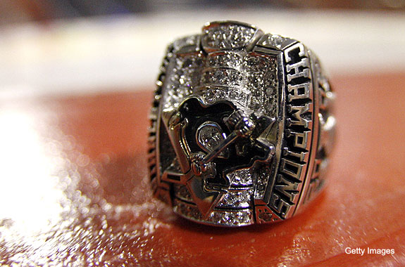
As you can see in this gallery from the Penguins, there's a bit more color on the front of the ring than with the Blackhawks'. From the team:
Each 14 karat white and yellow gold ring contains 167 diamonds, totaling approximately 4.50 carats of diamonds and averaging approximately 100 grams of gold. The top of the ring is crowned with a custom-cut black onyx imbedded with a 1.3 carat pear-shaped diamond to create the Penguins logo. The logo is placed on an image of the Stanley Cup, which is sitting on a bed of round diamonds replicating the arena and ice surface.
They were the largest rings in Stanley Cup champions history, but smaller than those for the Pittsburgh Steelers for winning Super Bowl XLIII, according to the Tribune-Review.
Here are the Detroit Red Wings' rings from 2008:
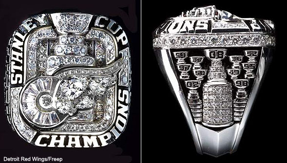
The Wings were given their rings in a dangerous spot: the Motor City Casino, during a private team function. Luckily, none of them ended up on the craps table.
According to the Hockey Hall of Fame, it's a "67-gram 14K white gold ring that contains 170 round diamonds, 2 marquise diamonds, 3 pear shaped diamonds and 11 custom cut baguette diamonds." It has several words on it: "Stanley Cup Champions"; "Owner," which is found by four diamonds in honor of the four titles under the Ilitch family; and "Family," because the Red Wings consider themselves a big one.
Here are the Anaheim Ducks' rings from 2007:
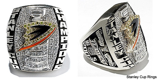
The Ducks' rings were made of 14K white gold and 110 diamonds, including 16 diamonds to represent the 16 wins it takes to capture the Cup. But there was some other interesting symbolism as well:
While being a token of last season's success, the ring also pays homage to past Ducks seasons on its left side, where under the player's last name are 14 stones in three different colors. The first 11 are green to symbolize the 11 seasons of the Mighty Ducks under Disney ownership. The next stone is white, symbolizing the lockout, a canceled season and a period of change. Finally, the last two stones are orange and represent the past two years of ownership by Henry and Susan Samueli and a change in name and colors. Also prominent on the right side of the ring is a representation of Honda Center and the old Mighty Ducks logo, which is flanked by '93 and '07 as the years in between the championship.
They put a diamond on the ring to symbolize the lockout? Seriously?
No comments:
Post a Comment